浮动
float的初衷
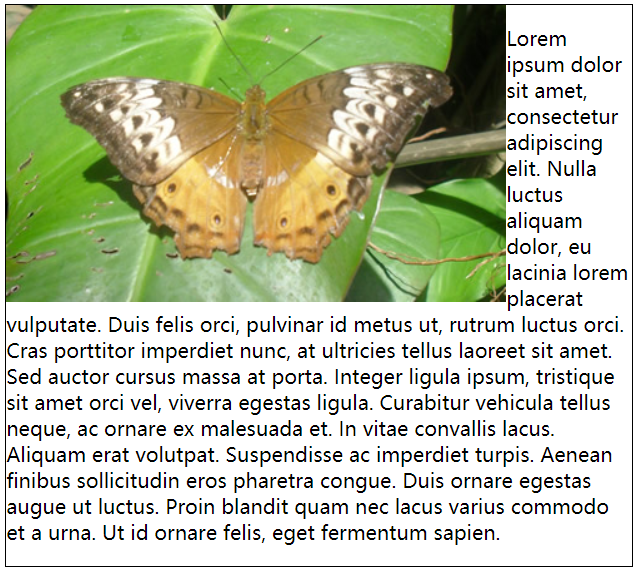
首先介绍引入float属性的初衷:为了实现文字环绕图片的效果,就像下面的例子:
1 | <div style="width: 500px; border: 1px solid black;"> |
利用float布局
在此之后,人们开始利用float属性进行布局,不过需要了解如下内容:
- 一定要为浮动元素设置宽度。
- 当前一个元素非浮动,后一个元素浮动时,浮动元素在原水平位置向左或向右浮动。
- 当前一个元素浮动,后一个元素也浮动时,后一个元素会在宽度允许的条件下与前一个元素挤在同一行。如果两个元素都是向左浮动,且前一个元素宽度过大导致两个元素无法放置在同一行,这个时候如果给后一个浮动元素设置适当的负的左边距,那么它会浮动上去与前一个元素发生重叠(默认后一个元素在上方)。
- 当前一个元素浮动,后一个元素非浮动时,如果后一个元素不是BFC,则会发生重叠。如果后一个元素是BFC,则不会发生重叠。
围住浮动元素
浮动元素脱离了文档流,其父元素也看不到它了,因而也不会包围它。
1 | <div style="width: 500px; border: 1px solid black;"> |
这个效果明显不是我们实际想要的,为了解决这个问题,介绍下面几种让父元素围住子元素的方法。
下面几种方案的效果都是一致的,如下所示:
利用overflow
1 | <div style="width: 500px; border: 1px solid black; overflow: hidden;"> |
同时浮动父元素
1 | <div style="width: 500px; border: 1px solid black; float: left;"> |
利用clear
clear属性的值分别为:left、right和both;clear属性指定一个元素是否必须移动(清除浮动后)到它之前的浮动元素下方。
1 | <div style="width: 500px; border: 1px solid black;"> |
定位
position属性有四个可选值:static、relative、absolute、fixed和sticky,默认值为static- 只有当
position属性为relative、absolute、fixed或sticky时,top、right、bottom和left才会其作用。 top、right、bottom和left是根据盒模型进行设置的。- 如果使用百分比值设置
top、right、bottom和left,则是相对于最近的块级祖先元素的宽高来计算的。
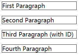
静态定位
1 | <p>First Paragraph</p> |
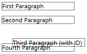
相对定位
- 相对定位是元素相对于它原来在文档流中的位置定位;
- 可以使用
top、right、bottom和left来调整元素的位置; - 相对定位的元素仍然处于文档流中,它原来的位置会被保留。
1 | <p>First Paragraph</p> |
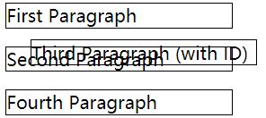
绝对定位
- 绝对定位会将元素从文档流中拿出来,它是相对于定位上下文进行定位的;
- 可以使用
top、right、bottom和left来调整元素的位置; - 绝对定位默认的定位上下文是
<body>元素; - 如果绝对定位的祖先元素中有
position属性值不为static的元素,那么绝对定位就以其为定位上下文。
1 | <p>First Paragraph</p> |
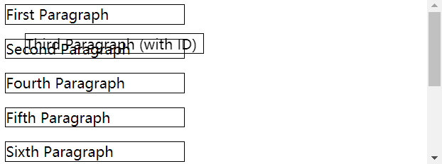
固定定位
- 固定定位会将元素从文档流中拿出来,它是根据视口(浏览器窗口或手持设备的屏幕)进行定位的,所以在页面滚动时,它的位置也不会改变;
- 可以使用
top、right、bottom和left来调整元素的位置。
1 | <p>First Paragraph</p> |
粘性定位
- 粘性定位没有脱离正常的文档流。它可以看作是相对定位和固定定位的结合。
- 必须使用
top、right、bottom或left来设定一个阀值。 - 当距离没有达到阀值时显示效果与相对定位相同。当距离在阀值范围之内时,显示效果与固定定位相同。
- 粘性元素被最近的块级祖先元素限制着,即当块级祖先元素消失在BFC范围时,粘性元素也会随之消失。
这里我理解的还不够透彻,就不写demo了,想看效果可以去MDN
flex布局
Flexbox是一种布局方式,我们称之为弹性布局。设置了display: flex的元素被称为容器(flex container),而它的子元素则称之为项目(flex item)。对于容器和项目,它们各自有着不同的CSS属性。
容器的属性
flex-direction
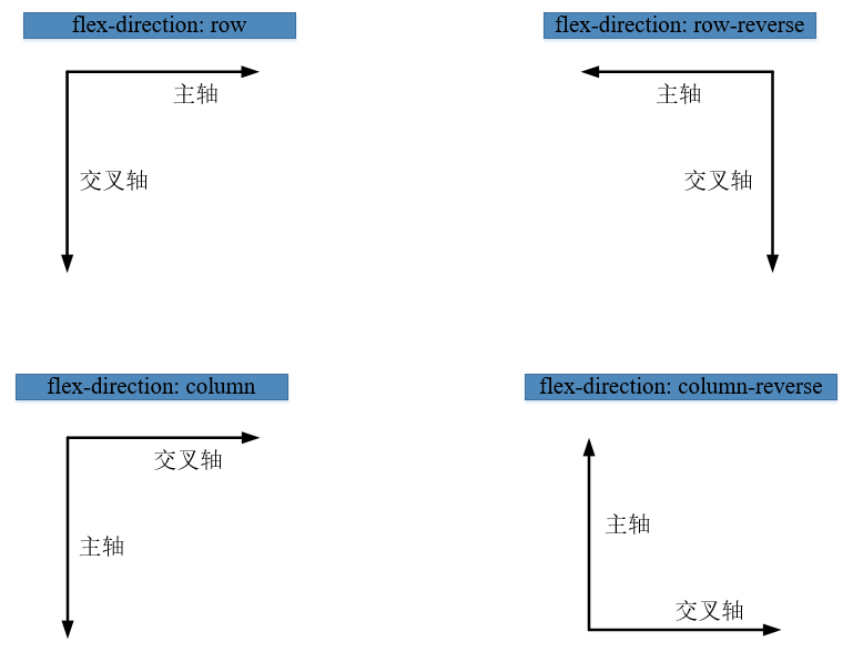
Flexbox中有两根轴:主轴和交叉轴。这两个轴代表什么取决容器上的flex-direction属性,它共有四个可供选择的值:row(默认)、row-reverse、column和column-reverse。
justify-content
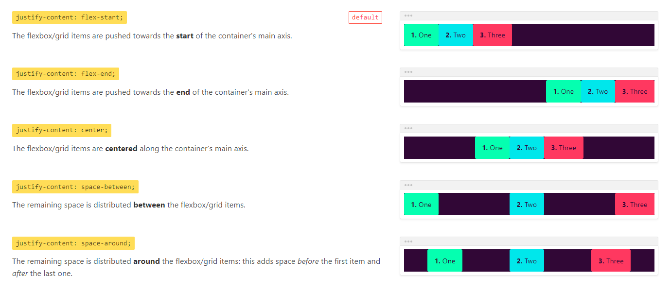
justify-content属性用于定义项目在主轴上的对齐方式。
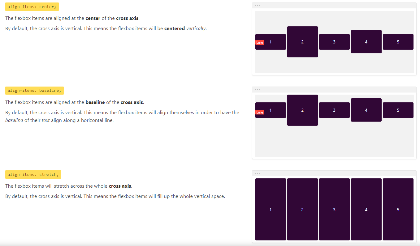
align-items
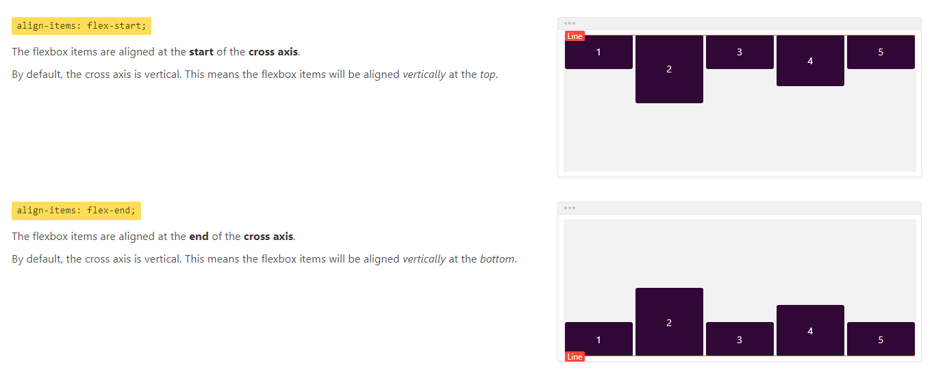
align-items属性用于定义项目在交叉轴上的对齐方式。
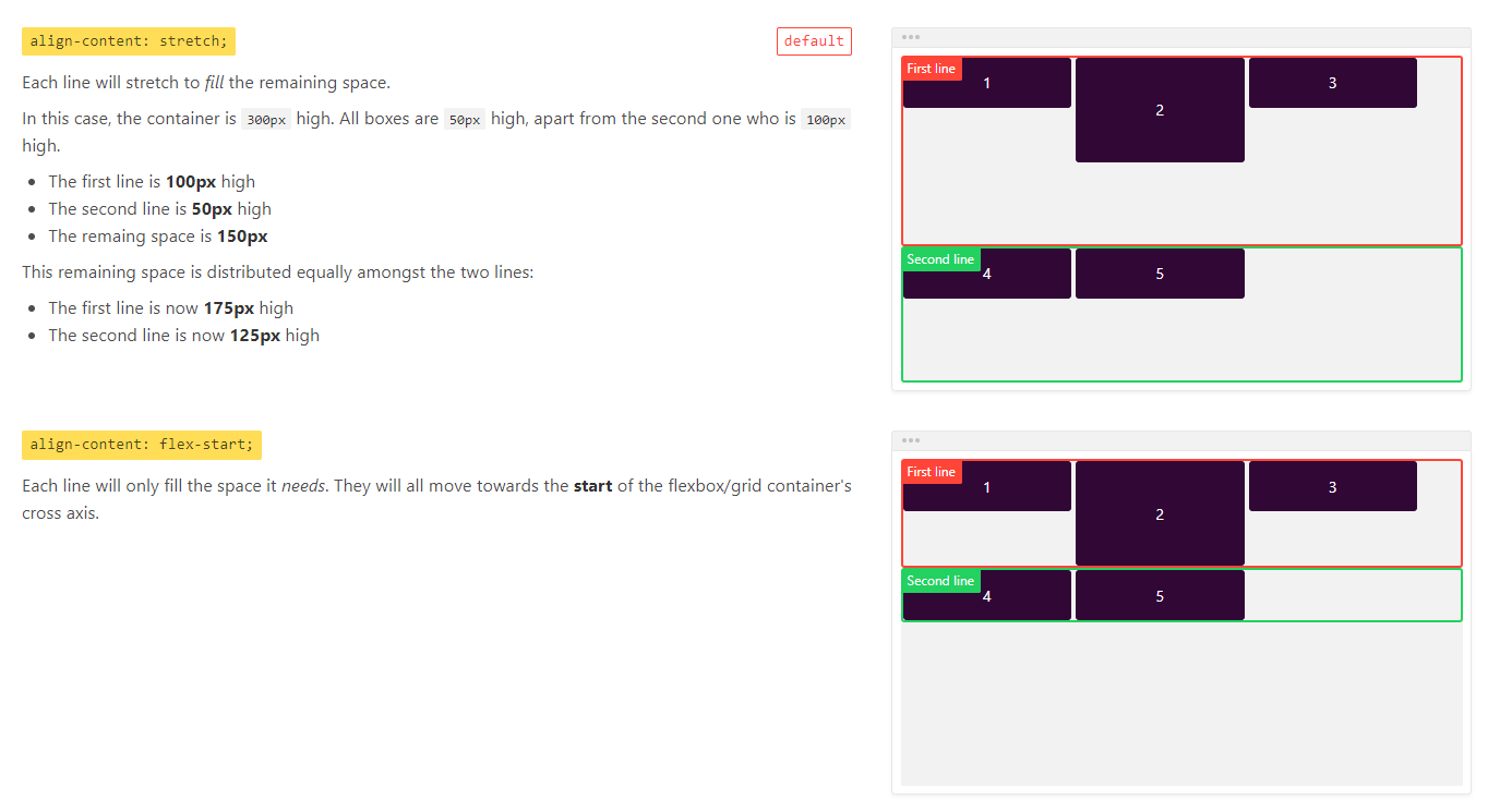
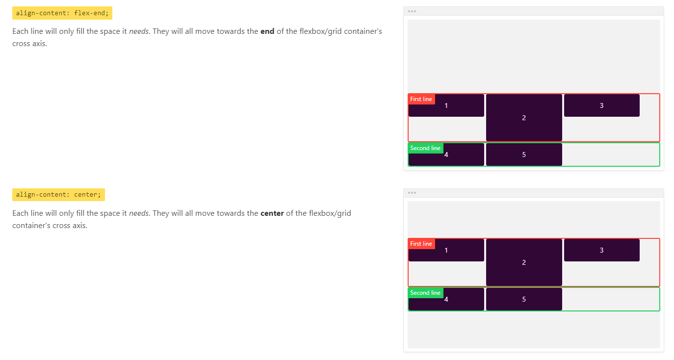
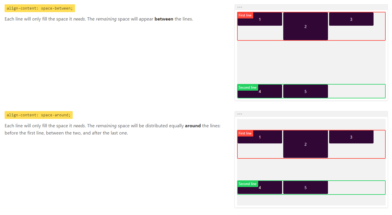
align-content
align-content属性用于定义多根轴线的对齐方式,如果项目只有一根轴线,该属性不起作用。
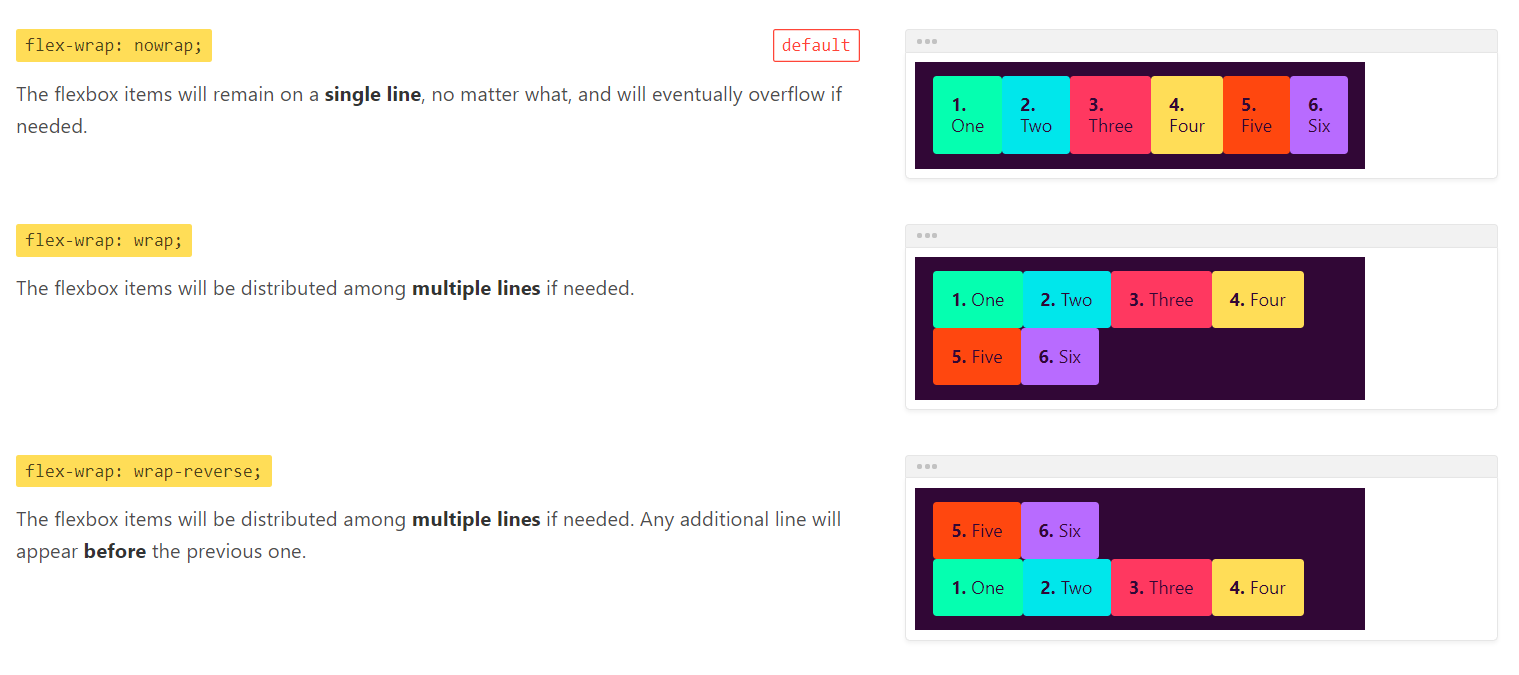
flex-wrap
flex-wrap属性用于定义当主轴上项目过多时,是否允许折行。
flex-flow
flex-flow属性是flex-direction和flex-wrap的简写形式。
项目的属性
order
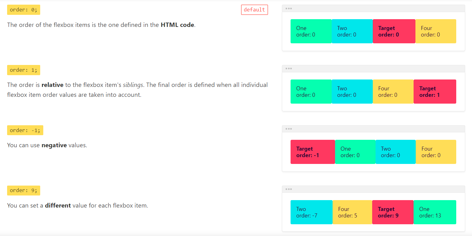
order属性用于定义项目的排列顺序。数值越小,排列越靠前,默认为0。
flex-grow
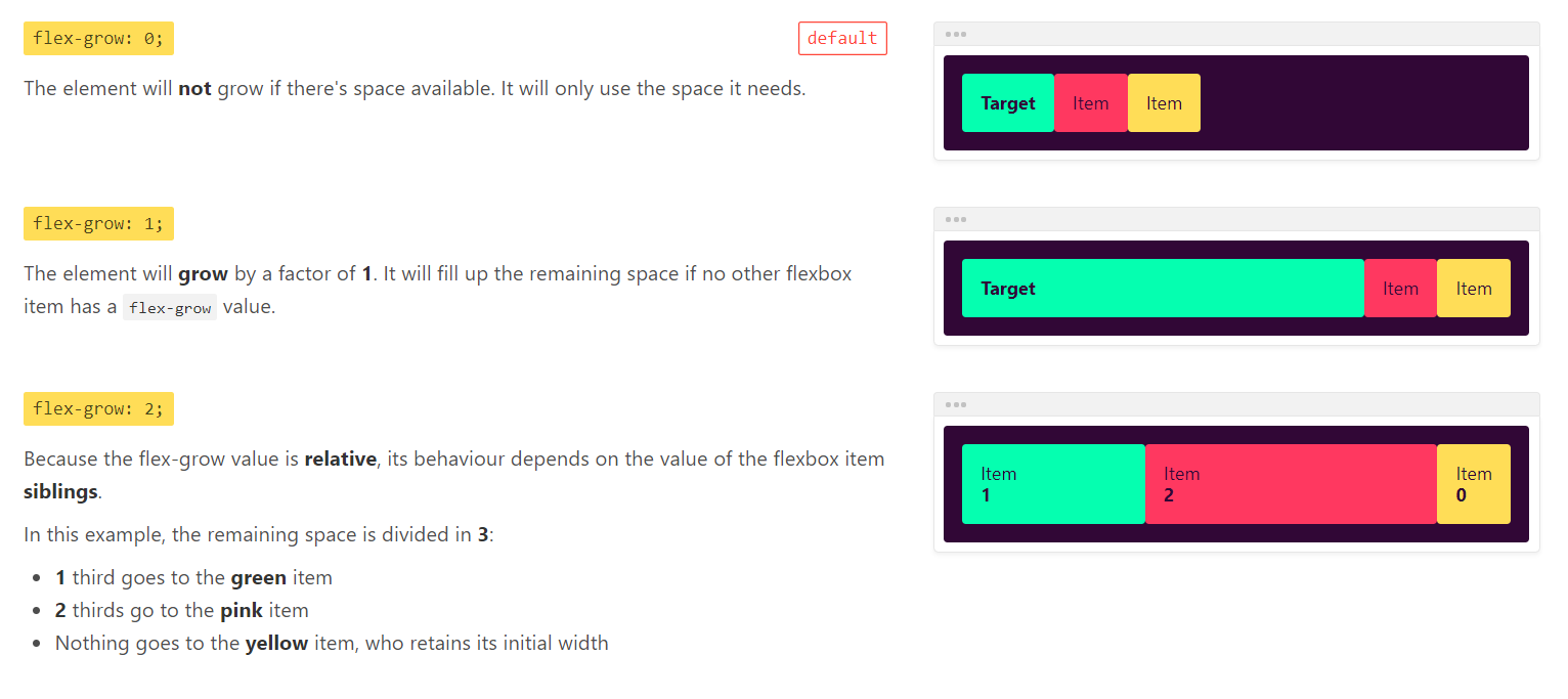
flex-grow属性用于定义项目的放大比例,默认为0,即就算存在剩余空间,也不放大。
flex-shrink
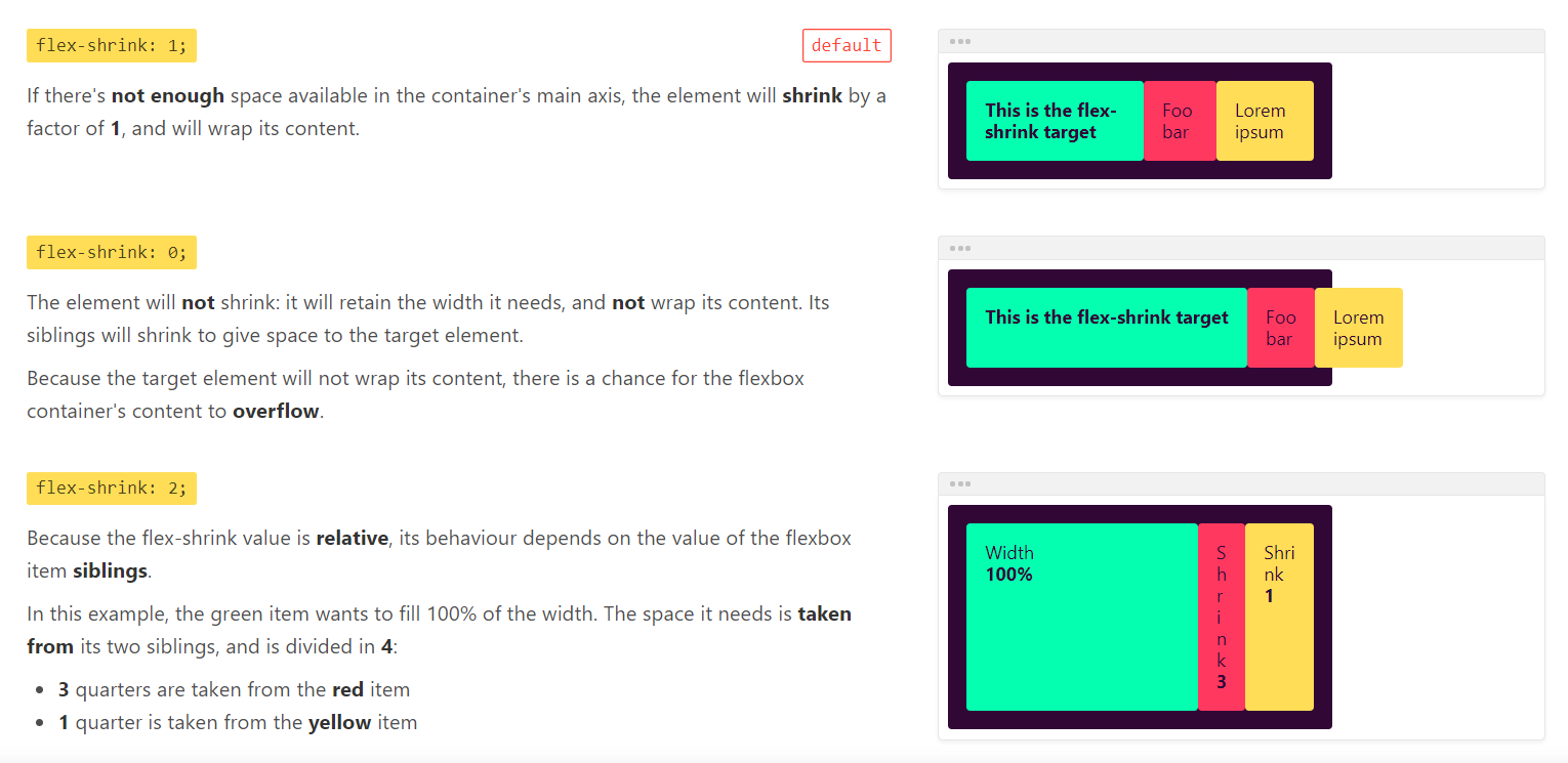
flex-shrink属性用于定义项目的缩小比例,默认为1,即如果空间不足,该项目将缩小。
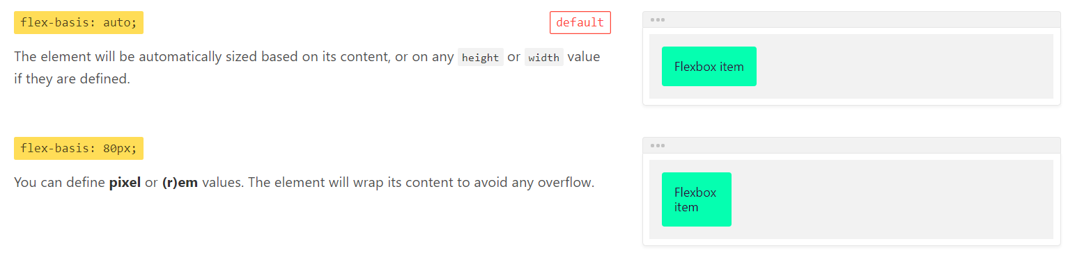
flex-basis
flex-basis属性用于定义项目在未放大或缩小前,占据的主轴空间大小,默认为auto,即项目本来的大小。
flex-basis设置的是元素的border-box,而不是content-box。
flex
flex属性是flex-grow、flex-shrink和flex-basis的简写形式。
align-self
align-self属性允许单个项目有与其他项目不一样的对其方式。可覆盖容器的align-items属性。
column布局
CSS多列布局扩展块布局模式,以便更容易地定义多列文本
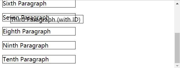
根据定义来看多列布局是为了定义文本的布局方式的,但实际上多列布局也可以应用于其他类型的元素上。看下面的例子,多列布局竟然能将元素以这种方式截断!
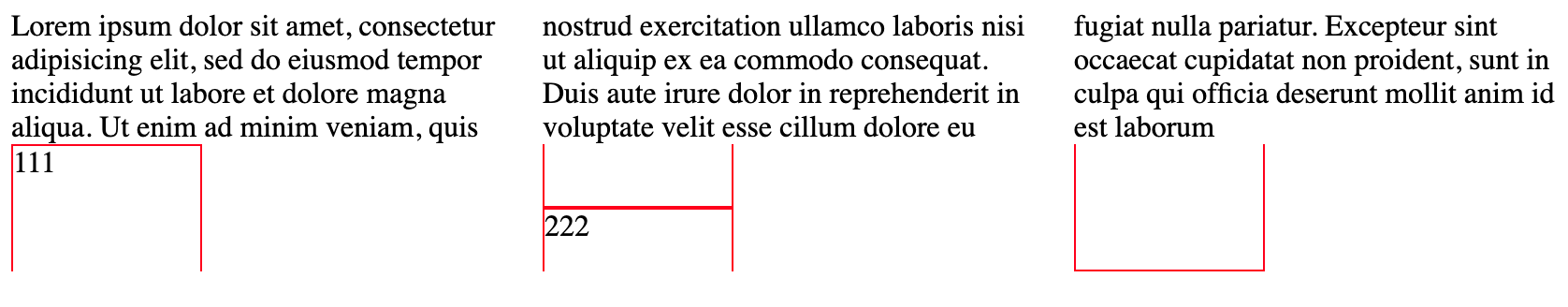
术业有专攻,还是将多列布局用于文本布局吧
column-count:设置列数column-width:设置期望最小列宽column-gap:设置列之间的缝隙大小
CSS3多列规范需要列高平衡:即浏览器自动设置最大列高,因此每列中的内容高度大致相同。除此之外,也允许通过height或max-height属性来限制列高,在生成新的一列之前每一列都会仅允许增加到这个高度
display属性
none:完全移除元素;inline:将元素变为行内元素,它的height和weight将不会起作用;block:将元素变为块级元素;inline-block:将元素变成具有height和weight的行内元素;list-item:元素表现得像是<li>一样;table:元素表现得像是<table>一样;flex:将元素变为flex container,其子元素变为flex item;inline-flex:将元素变为行内flex container;grid:将元素变为grid container。
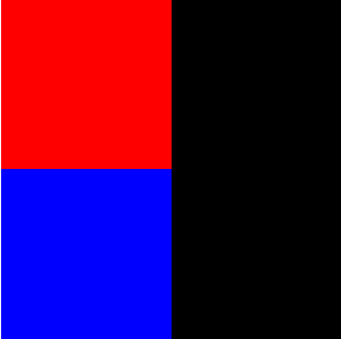
元素层叠
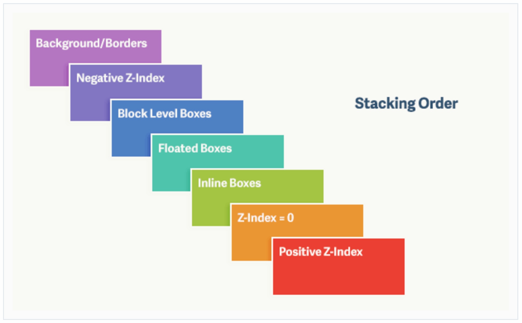
- 元素层叠是相对的;
z-index属性只有当对应元素的postion属性不为static时才有效。
下面的例子有助于理解元素层叠是相对的。
1 | <div id="outer"> |